Saturday, April 2, 2011

Temporary suspension of videos

Today I have some sad news. There will not be videos or posts for one-two weeks. The reason being that I am currently doing many different activities, and doing daily posts will just add to the stress. I will film me opening anything new, but no reopening packs, and sadly, no walkthrough.

Friday, April 1, 2011

Pokemon Artwork of the Day

 Golem from Expedition

Today's artwork of the day is Golem from the Expedition set (#14/165). It is done by the artist Aya Kusube, who has also done artwork for cards such as Swalot from platinum arceus, or Lugia from neo revelation. You can find a full list here: http://bulbapedia.bulbagarden.net/wiki/Category:Illus._by_Aya_Kusube. Now lets take a look. This card is basically all Golem, so there's no background. However, Golem itself makes up for this. It is done in a really incredible cartoon style, which even today looks awesome. It looks really cool with the huge amount of effort put into every single line. This also gives Golem the feel of being truly "rocky". Overall, I would give this card 4/5 stars, because it has a lot of effort and detail in it, and I like the style.

Thursday, March 31, 2011

Pokemon Card Artwork of the day

Skarmory from diamond and pearl stormfront


Today's artwork of the day is skarmory from diamond and pearl stormfront (#51/100). It is done by the artist Kagemaru Himeno, who has done artwork for over 400 different cards, some of which being gothitelle from the pokemon black expansion, or pinsir from the jungle expansion. For more information visit here: http://bulbapedia.bulbagarden.net/wiki/Kagemaru_Himeno. Now lets take a look at the card. First lets look at the background. This background is a nice, sort of Grand Canyon esque picture. First, there are the walls, which have a nice amount of detail put into them. Then there is the river. This is one of my favorite parts of this drawing. I love how each detail is carefully put into it, and you can see each little fleck that skarmory makes while skimming over it. Now lets take a look at skarmory, the centerpiece of this photo. This is done in an interesting style, leaving skarmory 2D, but making a very good show of how the lighting affects skarmory's look. I think it could be done a bit better, but it's still a nice style. Overall, I would give this card three out of five stars, because it is basically an average card artwork - nothing too great, but nothing bad about it either.

Wednesday, March 30, 2011

                          Pokemon Artwork of the day: Shining Raikou from Call of Legends


I just wanted to show off one of my favorite cards before I start getting into this new segment. This card is reasonably new, and is the shining raikou from the call of legends set, SL9. The artwork is done by Noriko Hotta, who has also done illustrations for cards such as Blissey prime from heartgold soulsilver, and shining deoxys from call of legends, another of my favorites. For a full list, you can use this link: http://bulbapedia.bulbagarden.net/wiki/Category:Illus._by_Noriko_Hotta. Without any further ado, let's take a look! One of the great things about this card is its background. I love the dark thunderclouds combined with the bright lightning. The colors combine well and have nice transitions, which is very important in making backgrounds. The center focus of the card is shining raikou, in all its glory. The artist did a nice job on giving raikou a mix between 2D and 3D. I also love how raikou is shooting lightning. Overall, I would give this card 5/5 stars, because the background looks great, and raikou looks completely amazing.

Tuesday, March 29, 2011

Pokemon artwork review of the day

Today I'm trying something new: pokemon artwork review of the day! This will be a daily segment that I post where I review ANY pokemon art (usually booster packs and cards) and give it a rating. Please tell me what you think of the new segment! But without further ado, let's get started!!!

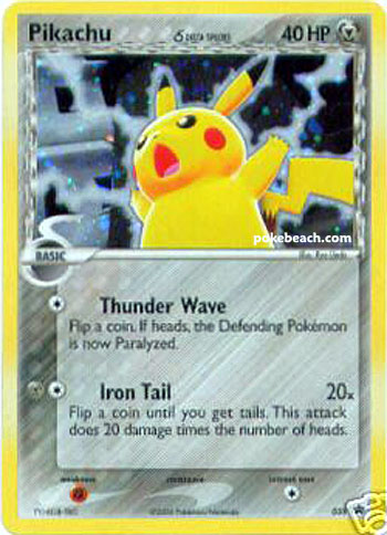
What better way to start out the new segment with the very pokemon that made the franchise popular? This is the pikachu from the POP series five pack, #13/17. Now lets take a look at the artwork. This pikachu is definitely unique, being the metal type. This gives the artists a chance to give it a more-grayish background, unlike the traditional yellow on normal pikachu cards. Pikachu is in what looks to be a forest, and really sticks out with its bright yellow coloring. One of my favorite aspects of this card is the glow around pikachu. This makes a nice transition between the yellow and grey, and really makes the artwork look good. This card also always gave the impression that pikachu was levitating around the forest, due to the glow, and really makes me feel like pikachu is the "guardian" of the forest. This, coupled with pikachu's wise face, makes this a truly unique card, as almost no other pikachu cards have non-smiling faces. Overall, I would give this card 4/5 stars, as it is really original pikachu artwork, and has nice intersecting colors.

Monday, March 28, 2011

New Video!!!

I just posted a new video!!! It's a video of me opening a japanese pack (whose set name still eludes me). Feel free to check it out, and the first part of my walkthrough will be uploaded tomorrow!!! I'm also thinking of doing daily segments here, but it's only an idea. Tell me what you guys think and feel free to give me suggestions.

Sunday, March 27, 2011

New Video!!!

I just made my first video!!! It's me opening a shining entei tin, so you can check it out to see what pulls I got. Unfortunately, the quality isn't the best, but the quality is said to improve after being uploaded, so hopefully it will get better.